CASE STUDY
Saga Peptides
A brand and a storefront, built from a blank page.
THE CHALLENGE
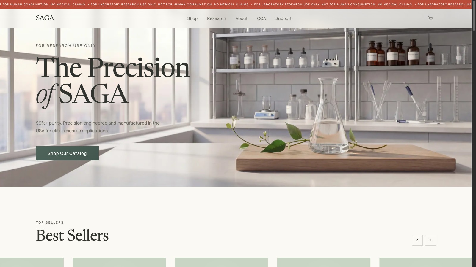
Saga came to us with no name recognition, no visual identity, and no site — just a plan to enter the research-peptide market and a bar to clear: look as credible and precise as the compounds being sold. Everything had to be built, not adapted from an existing brand.
OUR APPROACH
Rather than dropping a generic e-commerce theme into a regulated category, we treated brand and platform as one build. That meant designing the identity first — a "precision" positioning that could carry through packaging, product pages, and compliance language — then building the storefront around it from day one.
HOW IT CAME TOGETHER
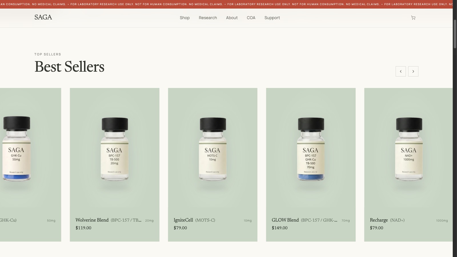
We started at zero: name treatment, logo, and visual language, followed by a full storefront with product catalog, checkout, and dedicated Certificate of Analysis (COA) pages. Messaging and page structure were built around the research-compound category specifically — cold-chain shipping, batch/lot transparency, and required disclaimers — rather than bolted on afterward. A custom React admin dashboard rounded out the build, giving Saga’s team control over inventory, orders, and content without touching code.
THE RESULT
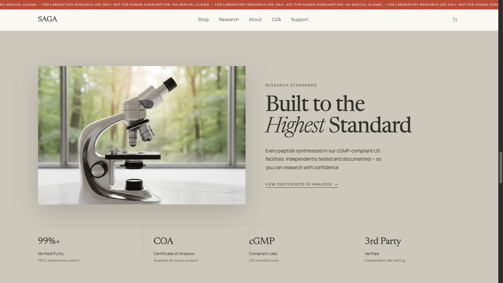
Saga launched with a complete, cohesive brand and a storefront built to earn trust in a category where trust is the entire sale — verified purity stats, COA access, and cGMP messaging all front and center.
WHAT WE WERE WORKING WITH
Research-compound e-commerce carries real constraints: mandatory disclaimers, no medical claims, and a customer base that specifically looks for lab documentation before buying. The design had to stay premium while never straying into language that could be read as a health claim.
IN THEIR WORDS
They took us from a name on a napkin to a storefront that looks like it's been in the game for a decade. COAs, compliance messaging, the admin — everything just works, and it shipped in weeks.